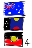
Flag
(new 2019 design is in) |
(.) |
||
| Line 10: | Line 10: | ||
<br clear=all> |
<br clear=all> |
||
| − | = 2019: Golden Wattle girt by sea = |
+ | = 2019: Golden Wattle Girt by Sea = |
| + | [[Image:Goldenwattle_girt.png|thumb|Golden Wattle "girted"|250px]] |
||
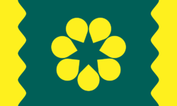
In [https://www.reddit.com/r/vexillology/comments/anm8hi/australia_united_aboriginal_white_peoples/efxm4kf/ this discussion thread on reddit] I noted that I felt the Golden Wattle seemed a little plain and perhaps it could do with something on the edges, Canadian style. This is the result of that - edging with waves. The wave has 7 peaks/troughs, matching the Wattle/Commonwealth Star, with the edge being the bottom of the 8th peak, allowing this design to "tile" smoothly. |
In [https://www.reddit.com/r/vexillology/comments/anm8hi/australia_united_aboriginal_white_peoples/efxm4kf/ this discussion thread on reddit] I noted that I felt the Golden Wattle seemed a little plain and perhaps it could do with something on the edges, Canadian style. This is the result of that - edging with waves. The wave has 7 peaks/troughs, matching the Wattle/Commonwealth Star, with the edge being the bottom of the 8th peak, allowing this design to "tile" smoothly. |
||
| − | |||
| − | [[Image:Goldenwattle_girt.png|thumb|Golden Wattle girted|250px]] |
||
This new design was posted to |
This new design was posted to |
||
Revision as of 01:03, 13 February 2019
|
There is a recurring (but often silent) debate in Australia about our flag.
I am of the opinion it's pretty bad, and we should have a new one.
There have been many designs over the years, including national competitions.
This page lists designs I've made, either original or tweaks of others, either serious or satire. All with credit where due (As of 2017, the 2014 design is the only one I consider wholly my own).
2019: Golden Wattle Girt by Sea
In this discussion thread on reddit I noted that I felt the Golden Wattle seemed a little plain and perhaps it could do with something on the edges, Canadian style. This is the result of that - edging with waves. The wave has 7 peaks/troughs, matching the Wattle/Commonwealth Star, with the edge being the bottom of the 8th peak, allowing this design to "tile" smoothly.
This new design was posted to
- Twitter: https://twitter.com/nemothorx/status/1095296281436536833
- Reddit: https://www.reddit.com/r/vexillology/comments/apssic/golden_wattle_flag_proposed_for_australia_but_now/
- Facebook: https://www.facebook.com/nemothorx/posts/10157159186583216
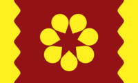
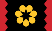
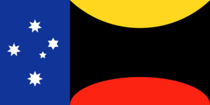
From the facebook discussion, a further two variants. One on ochre background to suit Australian natural earth colours. The other matching indigenous flag colours, maintaining yellow center, on a black sky, with waves to the side - now red and could be seen to be symbolic of spilled blood
2017: Wattle Throbber
A twitter discussion thread about my modified Blaxland/ErikVeland flag led me to consider the satire potential of flag designs. This is after I described the Golden Wattle design as "clever yet boring"
Here I simply take the Golden Wattle proposal, and animate it as an browser activity/waiting "throbber".
- While we're waiting for Australia to get decent internet, waiting for Australia to get on board with marriage equality, waiting for Australia to have a space agency, waiting for Australia to get on board with renewable energies, waiting for Australia to get a new flag...
- waiting, waiting, waiting...
- Twitter discussion: https://twitter.com/nemothorx/status/879905174713622528
- http://www.goldenwattleflag.com/
- https://en.wikipedia.org/wiki/Throbber
2017 Modified Blaxland/ErikVeland
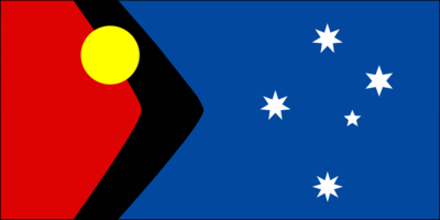
My 2014 design came about from a discussion based on the "Blaxland" flag, and I made special note at the time of a variant of that design by ErikVeland. I liked the design, but there were elements of it which niggled at me. Primarily, I felt the boomerang should point to the right, and the Aboriginal flag should not be over-rotated (ie, presenting as nearly upside down)
In 2017, I returned to that design to tweak those niggles away. I take Erik Veland's flag and brings it to the same proportions as our current flag, which gives room to then reverse the boomerang so it aims "right", and then the embedded Aboriginal flag no longer has to be over-rotated.
Design Elements
- The golden sun is centered on the center of the former union jack.
- The southern cross stars remain in their original positions and sizes (inner and outer diameter unchanged)
- The southern cross stars change numbers of points to match the Victorian and NT flags. (5,6,7,7,8 points, rather than 5,7,7,7,7 in the current Aus Flag)
- This provides a link to the original pre-Federation flag design, which had stars of 5,6,7,8,9 points
- Provides a link to the the current flag with Commonwealth star of 7 points
- Provides a link to the Eureka Stockade flag of 8 point stars.
Links
- John Blaxland's design: http://theconversation.com/a-proposal-for-a-new-mature-australian-flag-24714* SBS story on the Blaxland design which prompted the reveal of many others, including Erik Veland: https://storify.com/sbsnews/australian-flag-redesign/elements/425bae536ec035d32591f22e
- Erik Veland's design directly https://twitter.com/ErikVeland/status/448989303117344768
- My twitter announce of this design: https://twitter.com/nemothorx/status/868969911615242240
- I note for the record that Erik Veland quote-retweeted, and John Blaxland directly retweeted this
2014: "Sun and Rock"
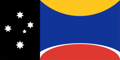
This is my 2014 flag design idea. I'd not even go so far as to say it's a proposal, but I hope it gets people thinking.
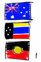
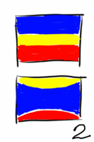
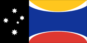
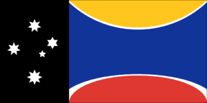
Taking a layout cue from the NT and ACT flags, the left third is a solid base with the southern cross. I've chosen a black base, with the original (and Victorian and NT state) southern cross. (This is identical to the NT flag). To the right, a blue field has a yellow arc above, and red below. The top is to be read as the sun, and red as uluru. They are shaped appropriately. You can imagine the white band between red and blue as a heat-haze if you like, but really it's just to separate the blue and red from touching (which would be bad design karma :) - it also means the flag includes colours from both our current and aboriginal flags.
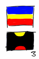
Sketches prior to final design
Variants on the design
2011
For many years, my favorite flag design was the "Sun and Stars" flag, though I had some minor niggles with it. In 2011 I tweaked it's design by spreading the southern cross out better, and making them 8 pointed stars as a more overt reference to the Eureka flag, as well as adding to the symmetry of the design.
http://www.thereef.com.au/flag/
State Flags
I've a plan to create some new state flag designs also, inspired by the "United we stand" project of US state flags, and taking inspiration by the NT and ACT territory flags
Also useful reference: https://en.m.wikipedia.org/wiki/List_of_symbols_of_states_and_territories_of_Australia
New South Wales
Victoria
Queensland
Tasmania
South Australia
Western Australia
Northern Territory
- Nothing to change
ACT
External links and discussions
This thread has some good designs: https://storify.com/sbsnews/australian-flag-redesign/elements/425bae536ec035d32591f22e
See also:
The 2014 facebook thread from which the above sketches and design came from:
The 2016 facebook thread about flags:
The 2017 facebook thread about flags:
